4 Things Wrong with Health Fund Member Onboarding Funnels, and How to Fix Them

No matter the sector, the onboarding funnel is a crucial part of obtaining new customers. Ensuring this process is clear and efficient helps customers onboard easily while providing a good experience. As an early indication of a brand's attention to design, detail and delight, this is a make or break point in the journey.
To gather research and insights for Fusion’s Mobilising Health Funds report we became members of more than 15 private health insurance funds, evaluating their onboarding process and features of their mobile app. We applied for each fund on a mobile device (given a that mobile is a typical Australian's most used device), evaluating each process alongside the others to determine the state of the current market. Findings on the quality of their mobile app experience are in the report, but here we'll share some insights from the onboarding process.
1. First Interactions Shouldn't Be This Confusing
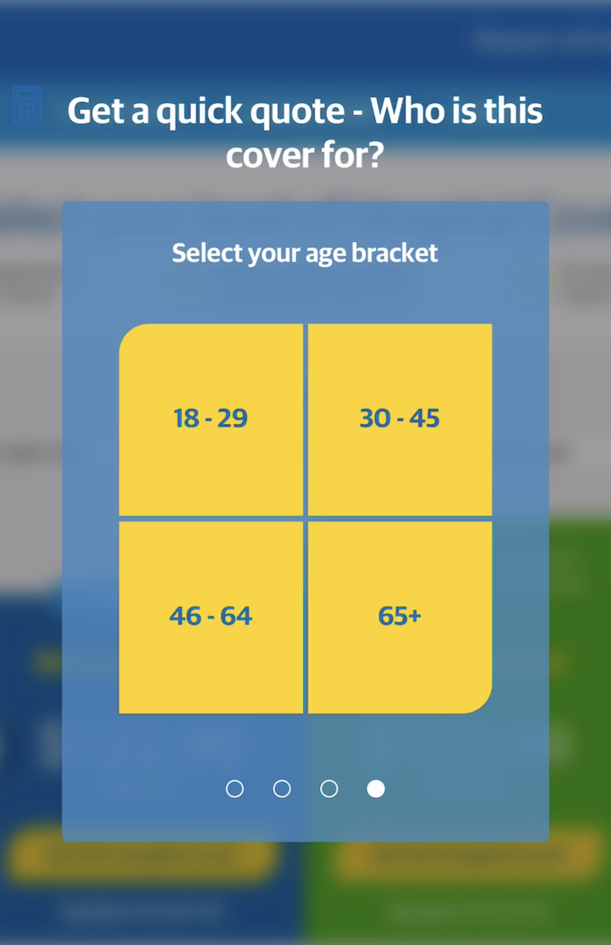
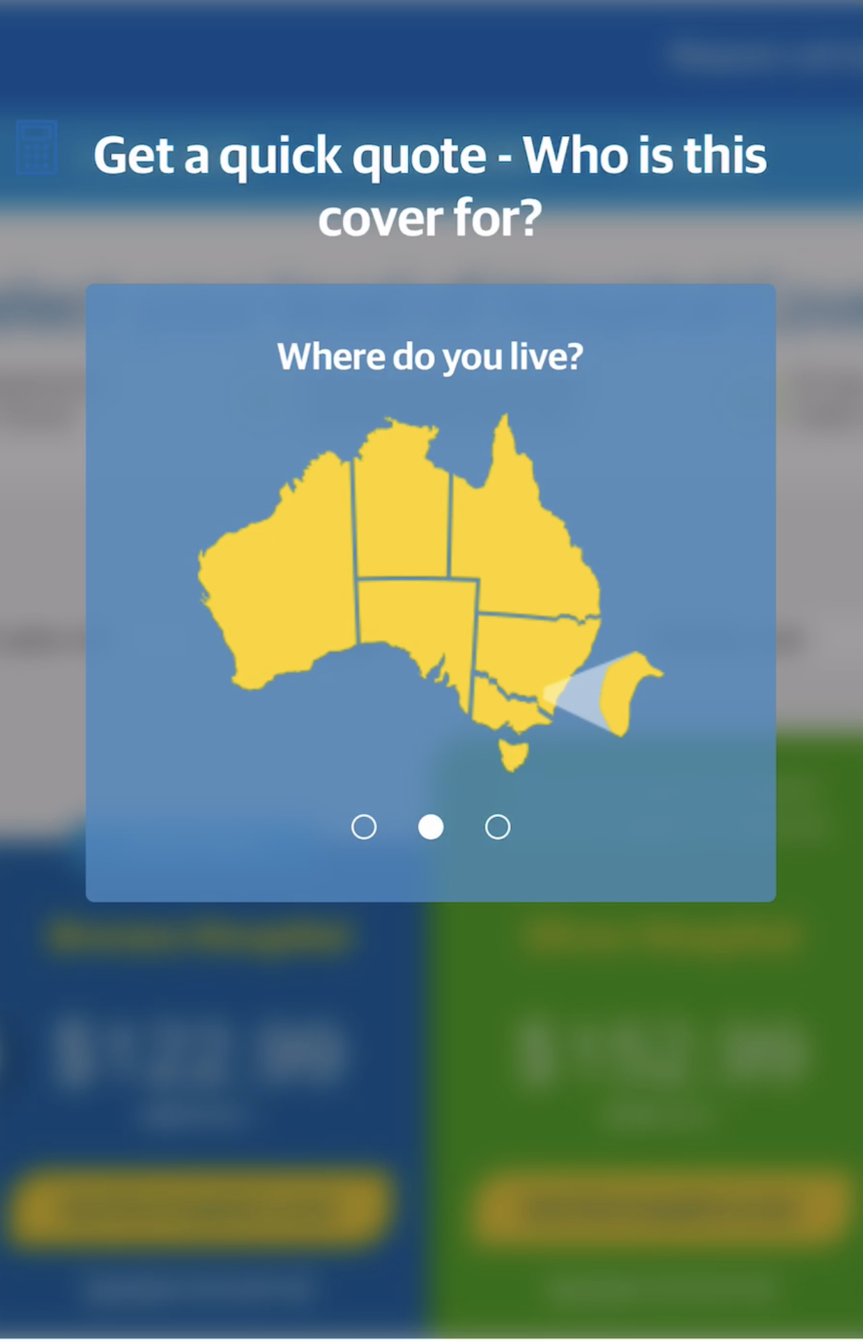
The application process may be the first interaction your new members will have with your brand (especially since they're likely to have arrived at your website from a comparison website or other third party), so it’s important that this experience is a seamless one. Cover selectors are usually the first step of the onboarding process. Picking the right product from a choice of dozens is intimidating!
In the worst cases, we were presented with an overview of every possible cover. With some brands having over 20 products to choose from, that's a lot of information to digest. When viewed on a mobile it became overwhelming and difficult to evaluate and compare products.
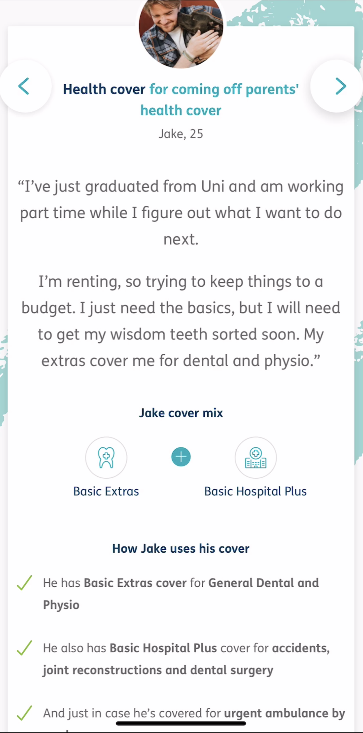
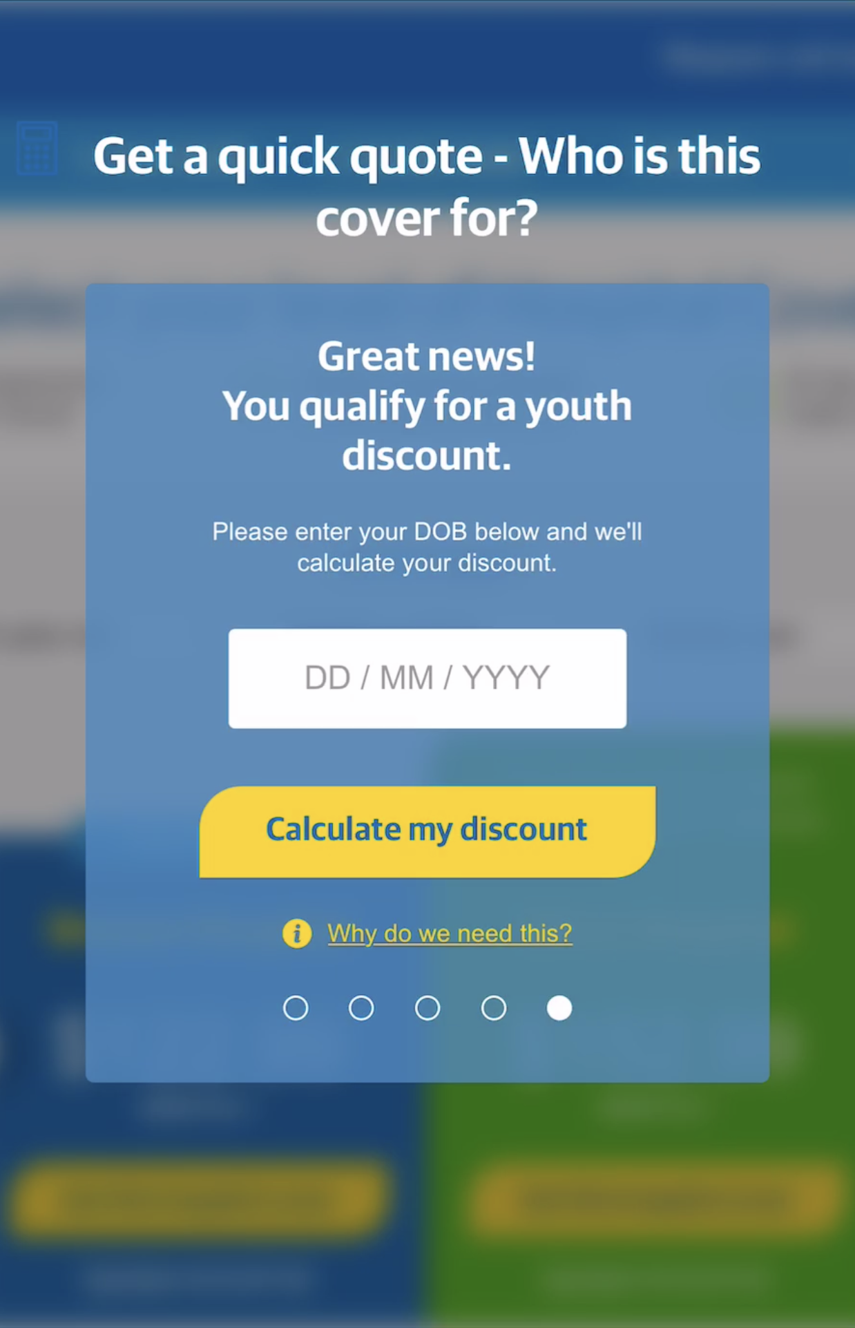
Better experiences occurred when we were are asked to answer some questions about ourselves and our situation. The product selector would then reveal a selection of cover options based on what best suited our needs. This personalisation made the process seem easier, reducing the confusion and making the product choice decision a simple one. We felt like our specific circumstances mattered most.
The Fix: Younger people are more likely to question the value that private health insurance can offer them1. Show that you’re considering their needs to prove your brand cares about them, rather than just selling a policy.
HBF bring a human element to the process with a variety of personas. Choose the example closest to your own situation and it will sugget a range of covers most suitable to you.
1. http://www.roymorgan.com/findings/7908-private-health-insurance-201903220158
2. Forms Take Too Long to Complete
For a product that typically has minimal modification, purchasing a policy takes a decent amount of time. On average, it took us 7 and a half minutes to join a health fund. You could create tight and toned abs in only 6 minutes, while someone spent this time, plus some more, FILLING OUT A FORM.
Enjoy this 3 minute video of becoming a HCF member. Keep in mind it's running at 5x speed.
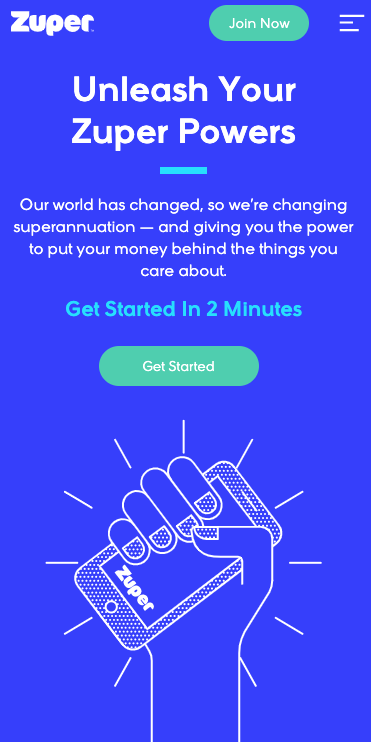
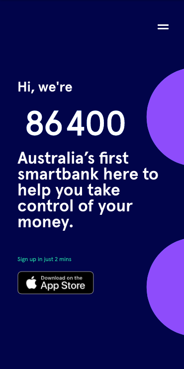
It doesn't have to be this way. Other organisations with decaying levels of trust and understanding about their products (like banks and superannuation funds) are acting to make the onboarding process as fast as possible. Digital bank 86 400 can onboard a member in under 2 minutes. Super fund Zuper, have a sign-up time of 120 seconds. Both encourage prospective customers to join up in their mobile app.
The Fix: Consider onboarding within your brand's app. The majority of brands in the banking and super industries have switched to this model, helping speed up the process for new customers and attract younger customers by living in their mobile-centric world.
3. Forms Lack Basic Efficiencies
An application form’s purpose is to facilitate the exchange of relevant information and convert potential members. It is crucial this process is as pain free for the customer as possible. An efficient form doesn't always equate to having the least number of steps. It requires smart design and thoughtful functionality.
Repetition was by far the most frustrating part of completing the application forms. Prior to joining we had provided details of our age and location within the 'quote' form. Those details then had to be re-entered as part of the application form, as well as entering our name at three different points. Grr.
Thankfully, one of the funds had considered this annoying issue by using prefills for the for the Medicare and banking sections. Considerations like this shave time from the process and restore any lost patience from previous applications.
In some instances, form elements were being cut off in the viewpoint, which required us to zoom-out to review each of their responses. This was not only fustrating, it slowed down our user journey considerably.
One of these design flaws can be frustrating for a prospective member, but when there are multiple, the user experience is seriously flawed. People have short attention spans. Faced with too much, it is likely they will give up on the process entirely. There's enough choice in the market that they can do so.
The Fix: Make form elements that share information autofill once that information has been entered. Question which information is essential, and which could be captured at a later date. Consider the mobile experience - it's the most popular device in Australia, so customers will want to fill out the form on this device.
Health Partners use quick-tap blocks and pictures to guide users through their form.
4. Legacy IT Processes Impact On Member Experiences
Once we became members, it was time to start using the fund's app. Much to our disappointment, there were more forms!
We were health insurance members, but not online members, silly us. In the service design journey, this is a perfect example of an organisation's system shaping the the process, resulting in an inside-out experience. Thankfully, with some funds we completed the online member process within the app. But, it had to be completed before using any of the features.
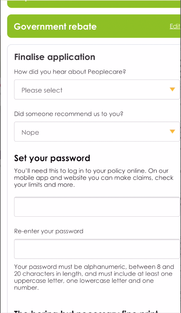
Reassuringly, there were two funds which didn’t require this last step. In their application process they asked members to create a password for their online member services (OMS). One quick interaction within the application process fast-tracked the entire OMS application. Hooray for less forms!
With Medibank, and many other funds, you have to register two different times before using online services.
The Fix: Consider when a completed process is more useful for your organisation than for the member. Revist this process to determine where it could be simplified, integrated elsewhere or if it's no longer relevant. Less is more!
Peoplecare create your policy and online membership all within the intial application process. Simple.
Why does the new member process matter so much?
We've seen the difference a well considered application and onboarding experience can make. Through user-centric and optimisation, your fund can increase conversion by 2 - 3x its current rate.
More members for sure, and more importantly, more happy members.
To find out more about the current state of mobile in the private health insurance industry, download our free Mobilising Health funds report. In this report get insights into the thoughts and opinions of senior managers and support staff across a range of health funds. Find out who is setting the benchmark for health fund mobile apps and what technologies are the focus for the future.