Accessibility in tech: how can we improve?
We all know the feeling; you’re in a hurry, looking for something on a website - but you can’t find it. The search continues, Then, when you finally find what you’re looking for, it’s in a spot so illogical that it’s no wonder it was so difficult!
Or maybe what you were looking for was right in front of you, but something about it (button design, form fields, colours that don’t make sense etc.) won’t let you finish the task you need to do. You jab and swipe and refresh the page. Nothing seems to make the functionality behave as you expect it to.
As annoying as situations like these can be, this is a daily (even hourly) occurrence for people with a disability. Most websites and mobile apps aren’t built to be easily accessible by disabled users, making their experience frustrating and at worst, impossible to perform.
This is why Fusion believes in making digital products as accessible for as many people as possible.
The exasperation of a poorly designed website or mobile app is completely avoidable, and good design and accessibility go hand-in-hand: after all, 1 in 5 people live with disability, and every single one of us (yes, you and I included) will experience some form of impairment in our lives.
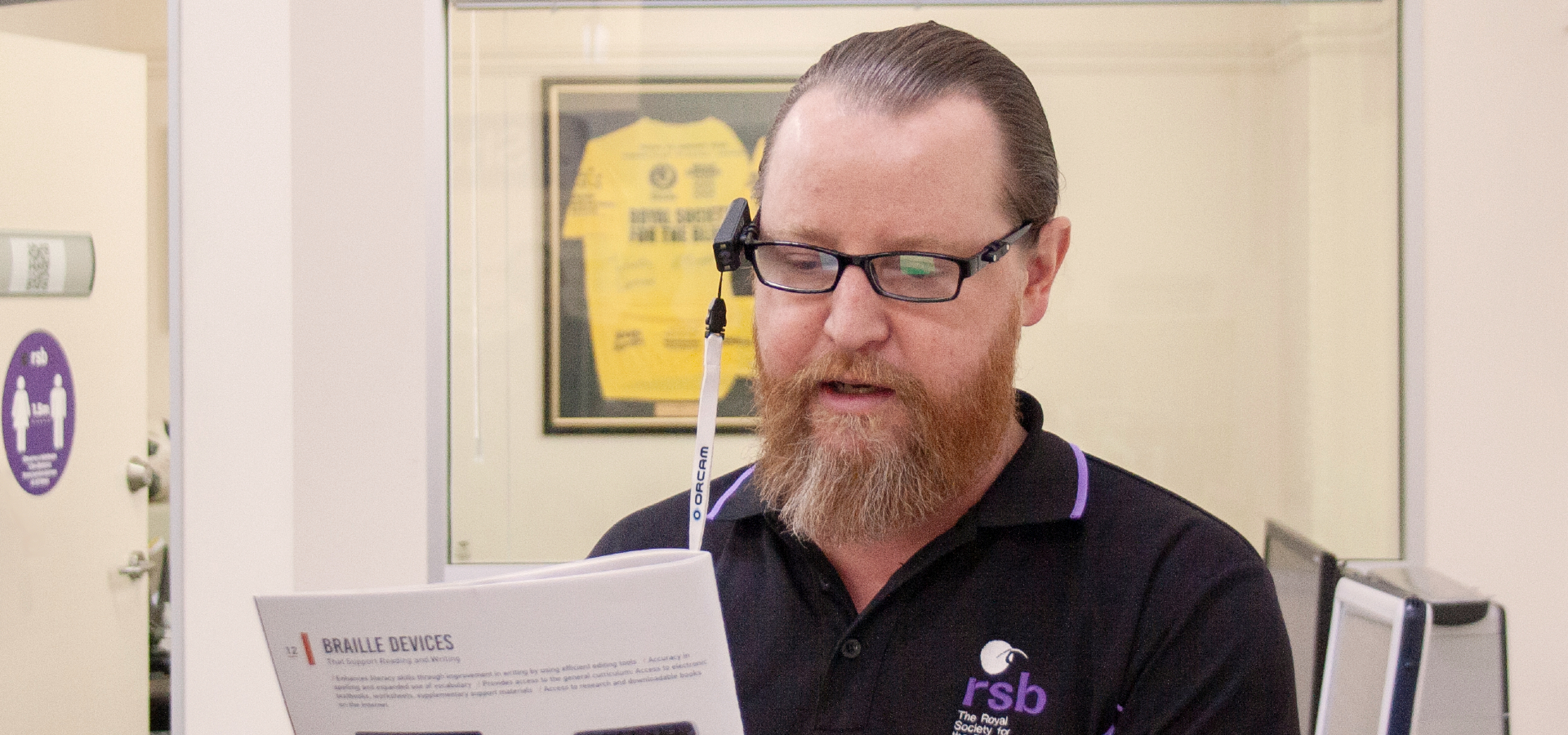
In a bid to learn even more about accessibility, Fusion celebrated Global Accessibility Awareness Day (GAAD) this year by visiting the Royal Society of the Blind to gain some insight into the world of someone with impaired vision as they navigated one of our own websites.
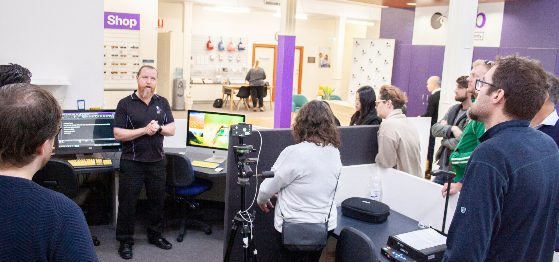
This isn't our first interaction with accessibility experts from the RSB. Fusion's mobile banking app has been put through rigorous testing by people with sight impairments to ensure that managing money isn't off limits to them.
Here are a select few of the practical ways we learned to improve accessibility (particularly for CMS editors):
- Zoom, Zoom, Zoom
Around 78% of people with vision impairment use a magnifier or zoom function when using a website, either by itself or along with screen reading software.
It might seem like a strange stat to point out, but simple things like too much white space can be difficult to navigate at 500% zoom. For example, an input field might be on the far left of the screen, with a submit button on the far right. Our developers address this issue by putting them closer together, or popping it all in a table, so at 500% zoom a user can still track along a straight line down to the field they need to see. - Become a header-hunter!
If there’s one thing you absolutely must use properly - you guessed it - it’s headers.
Someone with a screen reader navigates a website by scanning the HTML headers and skipping to the content that’s relevant to them (instead of having everything slowly read aloud).
But even without a screen reader, good headers just make life easier. Quickly and easily finding relevant content is every user’s dream - not to mention that good headers improve your SEO! - Be kind to screen readers
Screen readers don’t read out what the user can see on the screen, they read the HTML code for the page. So if one of our developers is creating a web page and can see that some extra information would make navigating the website with a screen reader much easier, they’ll add that in. Be careful with this, though, because unnecessary information will take time to be read by the screen reader, making it more frustrating for the user. - Don’t don’t Double double Alt alt Text text
Does your image have a caption? Great! Try not to repeat this information in the alt text of your image as well, though, because a user with a screen reader will hear that information twice. That might not seem like a big problem a couple of times, but if you scroll through an online store and hear repeated information for every single item, it can get very frustrating, very quickly.
Now of course universal standards do exist - in the form of World Content Accessibility Standards - but a short visit to the RSB made it very clear that these guidelines can overlook use cases.
Every user deserves an experience that feels seamless, and a product that they actually enjoy using, rather than something that leaves them feeling frustrated or overwhelmed.
As a digital product studio, it’s vital we constantly work towards improving products and finding new ways that make a difference to accessibility. If we want to do more than the bare minimum, then it’s extremely important that we seek out that information ourselves, and constantly update our toolkit so we can create the best product we possibly can.
With recent legal cases against big brands such as Coles, it’s imperative that organisations prioritise the ways in which people can successfully find, use and enjoy branded digital interactions. Fusion is passionate about helping you avoid this, so if you're looking for a solution to improving accessibility in your web or mobile experience, please contact us.
We were very privileged to visit the Royal Society for the Blind, and it was a visit we won’t easily forget. Not only did we learn how to make digital products more accessible, but the insight into the daily frustrations that people with impairments encounter highlighted one major theme:
As we learn and grow as a digital product studio, we aim to create better, more accessible products for everyone - and taking the time to understand accessibility is now a non-negotiable part of that.