Creating work people love
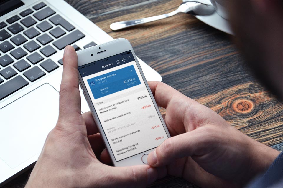
Case Study / Financial Institutions
Mobile Banking Platform
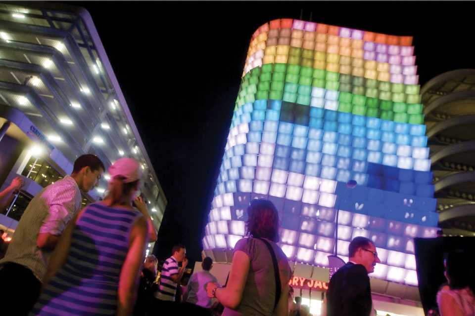
Case Study / Adelaide City Council
Illuminating Innovation
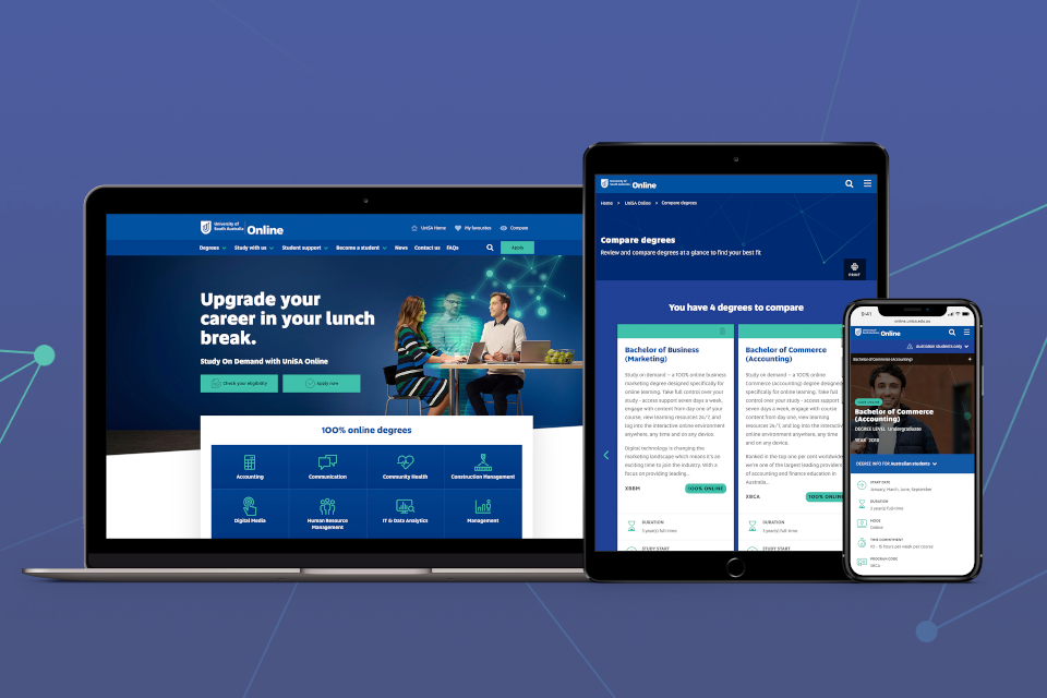
Case Study / University of South Australia
An Effortless Education Experience
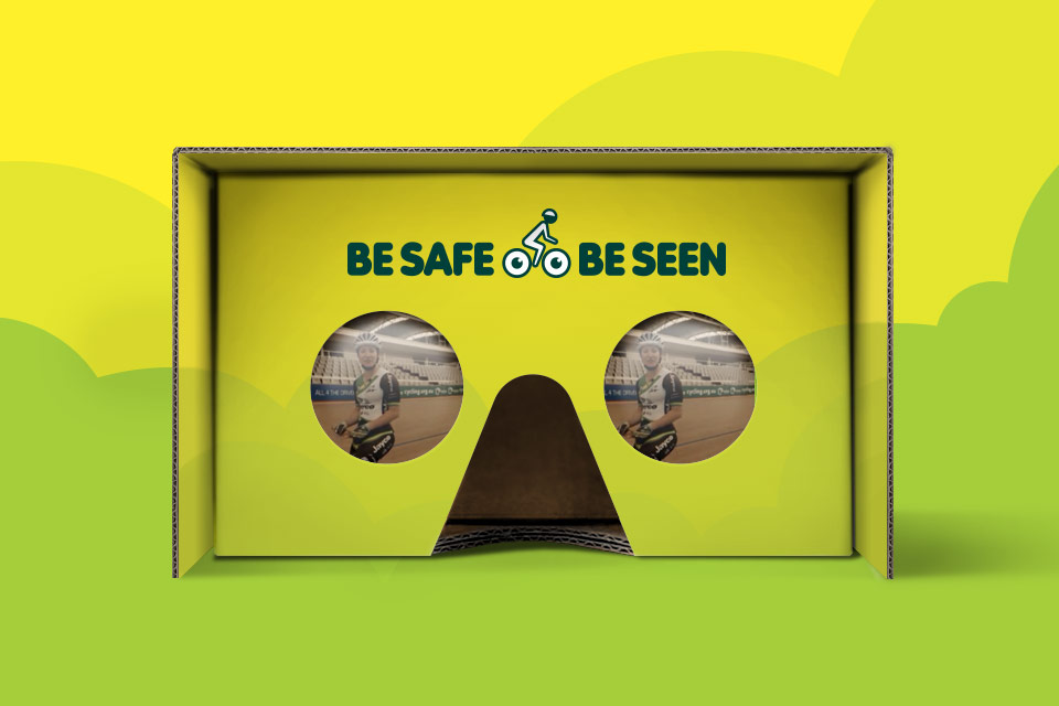
Case Study / Motor Accident Commission
The Ride of Your Life
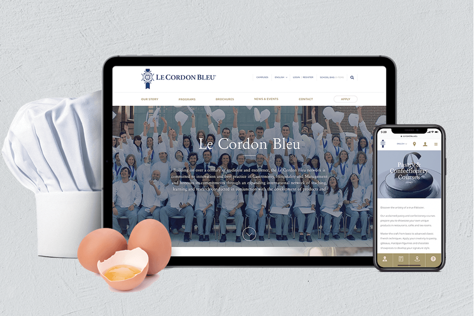
Case Study / Le Cordon Bleu
International Hospitality
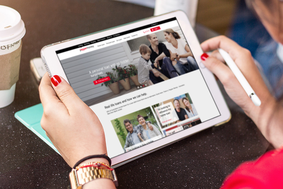
Case Study / Pepper Money
Three Goes Into One
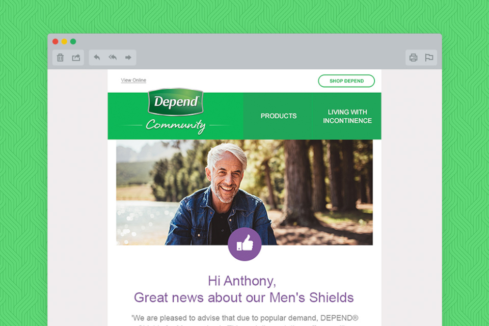
Case Study / Kimberly Clark Australia
Dependable Email Marketing
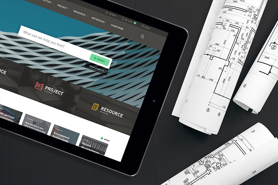
Case Study / Australian Institute of Architects
Smarter Practices
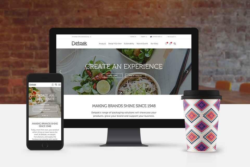
Case Study / Detpak
Delivering Delicious Results for Detpak
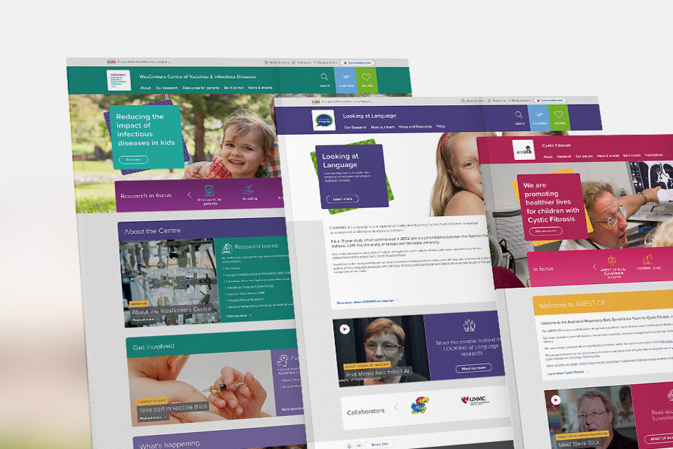
Case Study / Telethon Kids
Helping Provide A Better Quality of Life
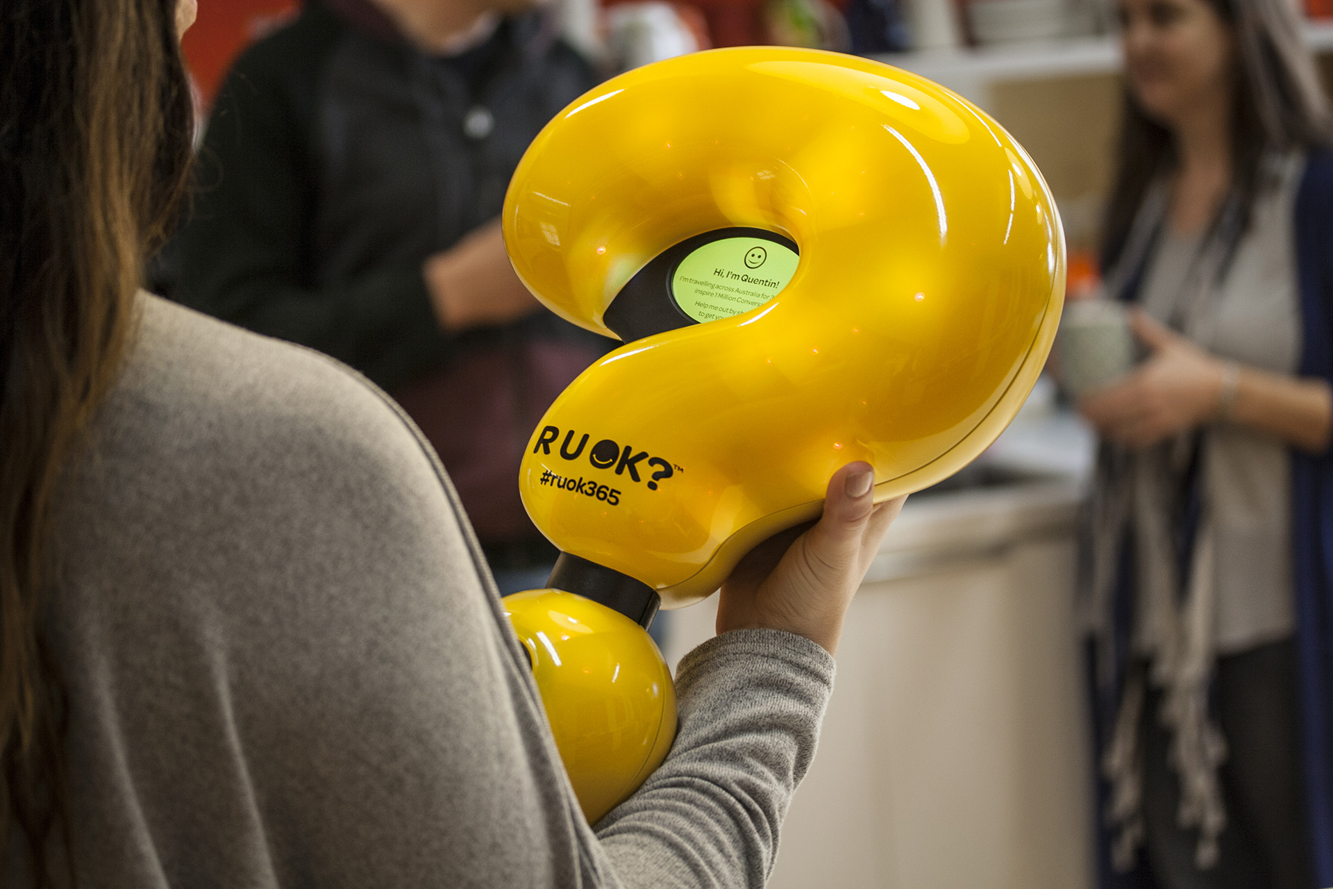
Case Study / R U OK?
One Million Conversations
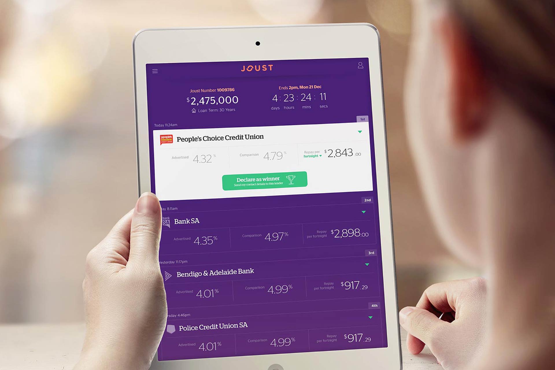
Case Study / Joust
Disrupting Lending
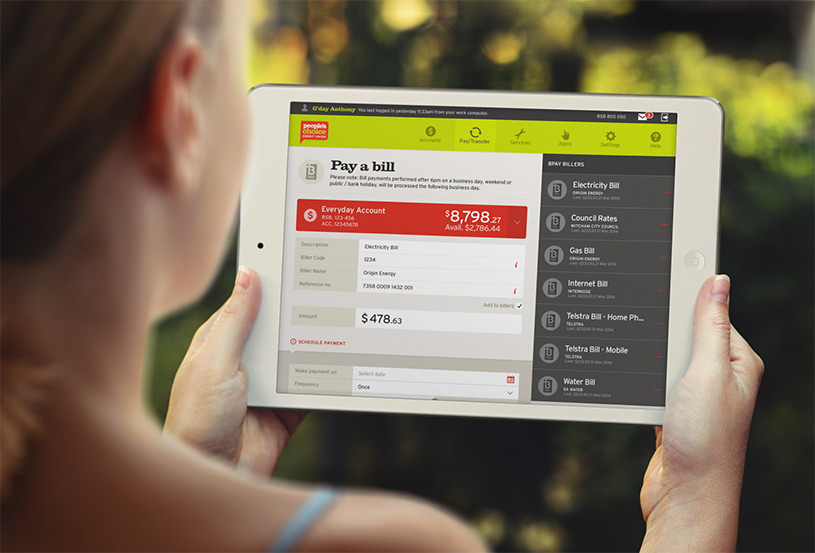
Case Study / People's Choice Credit Union
Digital Branch
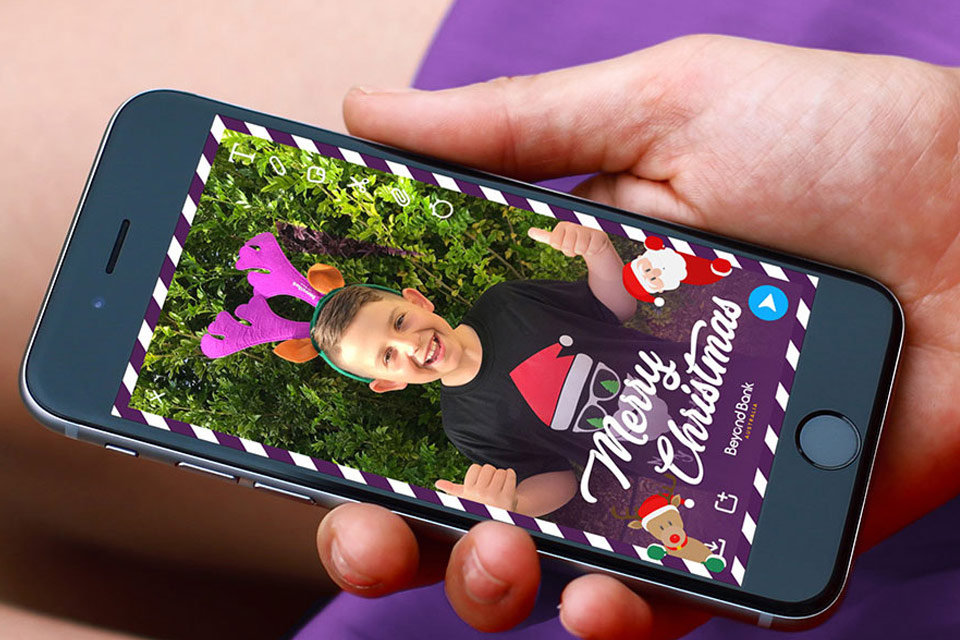
Case Study / Beyond Bank